How do I Wear More Than One Color in an Outfit?
If you've met or seen photos of me, you're pretty familiar with my love of color and print. This becomes noticeably more prominent simply because we live in the Northwest. After all, we love our grey. (Don't tell anyone, but I'm a huge fan of grey, myself.) As a personal stylist, I help women discover how to communicate who they are through their clothing. For some women, that includes color and print. For others, it does not. Both are great. Really. We don't all need to "wear more color." That being said, I find that many women would like to integrate more color into their wardrobe. But, the question is exactly how. And you know, Dear Reader, I live for these sorts of questions. So, here's a quick tutorial on mixing and matching colors in your outfit. P.S Here's a fun fact: Sir Isaac Newton was the first to organize colors around a wheel starting with the different wavelengths of light. I love Wikipedia.
How do I Wear Multiple Colors in One Outfit?
1. Opposites Attract.
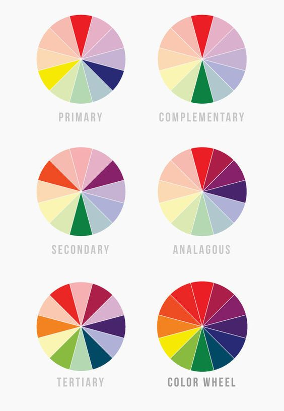
It all starts with the color wheel. Find the piece you'd like to wear today. Let's say it's a red skirt. Now, head to the color wheel and see what is the opposite. In this case, the opposite of red red is green. Red and green are complimentary colors. Fun fact: When you combine complimentary colors you get brown/black.
It's no accident that Christmas is largely defined by this color combination. You may opt to avoid this combo simply because of the holiday reference. But, at least you can now see how good opposite colors can look together. Consider this: Try a slightly different green and go across the color wheel to the opposite for a striking combo that is not associated with gift giving. Or try a pink skirt with a lighter green top. Ultimately, go with your instincts.
2. Monochromatic Always Wins.
Monochromatic means different tints or shades of a color. This is a big win for your outfit. Dressing in the same color elongates your frame. And, mixing things up with different tints of the same color makes it all more interesting and often more sophisticated. Try a dark purple skirt with a lavender top. If you have a triangle shaped figure, you'll draw the eye up with the lighter color, minimize your lower half and elongate your frame. Inverted triangle? Just do the opposite: a lavender skirt and dark purple top.
3. Embrace a nude shoe.
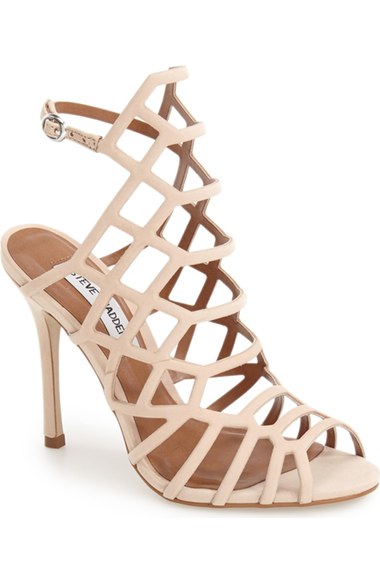
If you are mixing and matching several colors, embrace a neutral shoe to calm things down a bit. Also, nude shoes, especially heels, elongate your legs, which is never a bad thing.
4. Unexpected Neutrals.
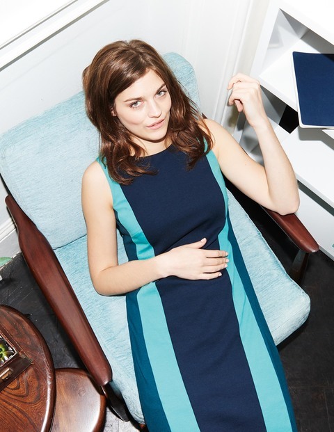
Yes, brown, grey, white, black, those are neutrals. But, I'd argue that when it comes to your outfit, just the right shades of blue and green can act as neutrals, too. Think of nature. The sky and the ocean work with everything. And, the stem never clashes with the flower. So, blue and green can work with any color, depending on the intensity of that color. This explains why my first two pairs of docs in high school were green and blue. I developed this logic at 15 and it still works for me. If this approach is new for you, start with navy blue and forest green and adjust from there.
5. Think About How Colors Make You (and the People Around You) Feel.
So, this is a nice way to start down a rabbit hole. There's lots of research to show us how we respond to different colors. I'm loving this short article in Buzzfeed on the topic. Here's a quick takeaway- If you'd like to create harmony, opt for analogous colors. Those are colors that are next to one another on the color wheel. And consider how different colors make you feel AND your audience. Giving a big presentation? Perhaps you'd be happier avoiding orange, yellow and brown as they were considered, "cheap" in one study. Like I said, rabbit hole.
And there's your mixing and matching colors 101. If this interest you, there is SO much information on it. Sure, there's the interweb. But, you can also ask your favorite artist about it at your next dinner party. You might want to consider reading up a little first.
On the Poplin email list yet? Get on it! New subscribers will receive my Style Extras series in your in box free for the next six weeks. Dying to hear what you think.

